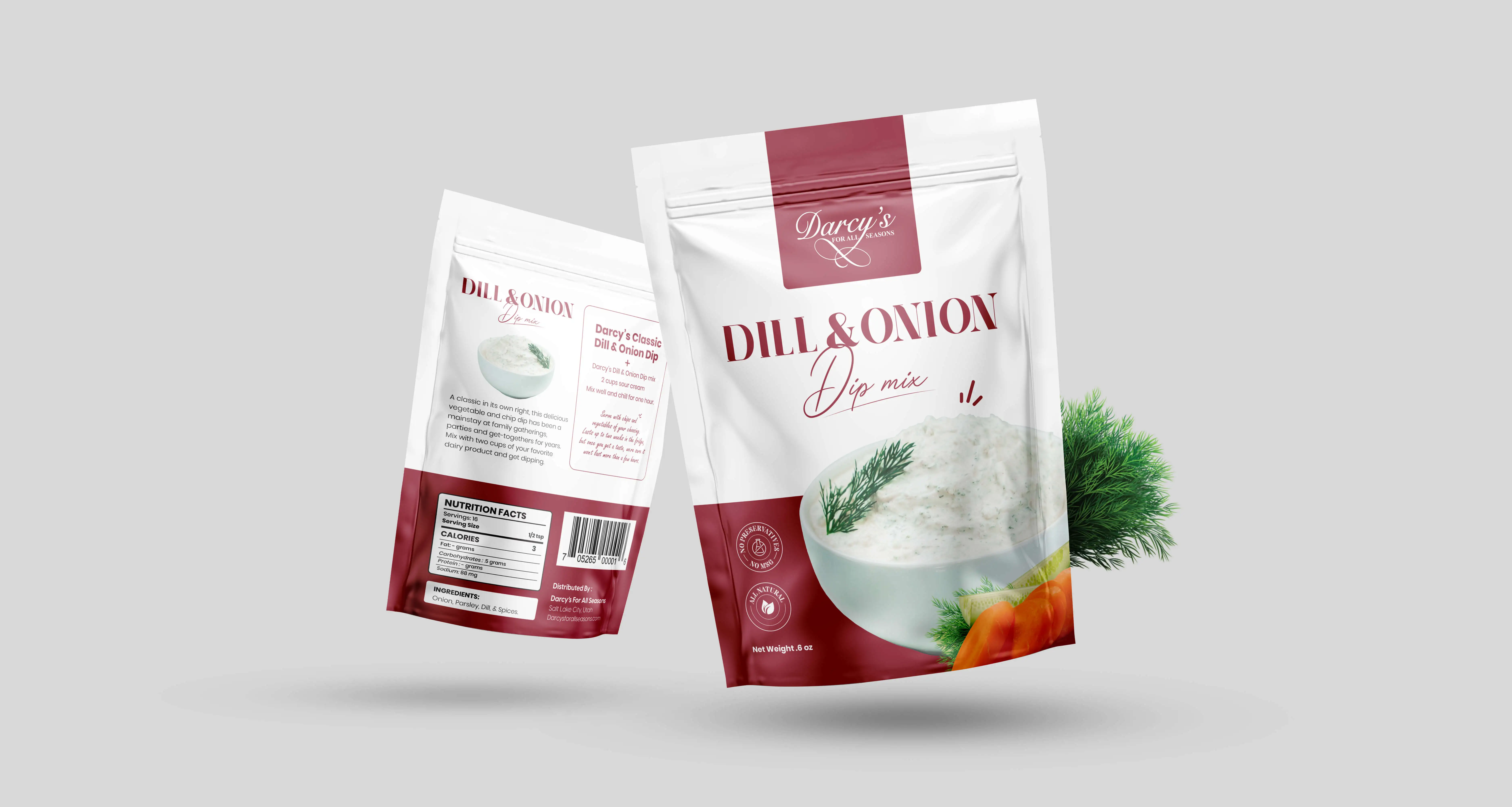
Client: Darcy's
Region: USA
Service: Packaging Design
Category: Food & Drink
Year: 2023
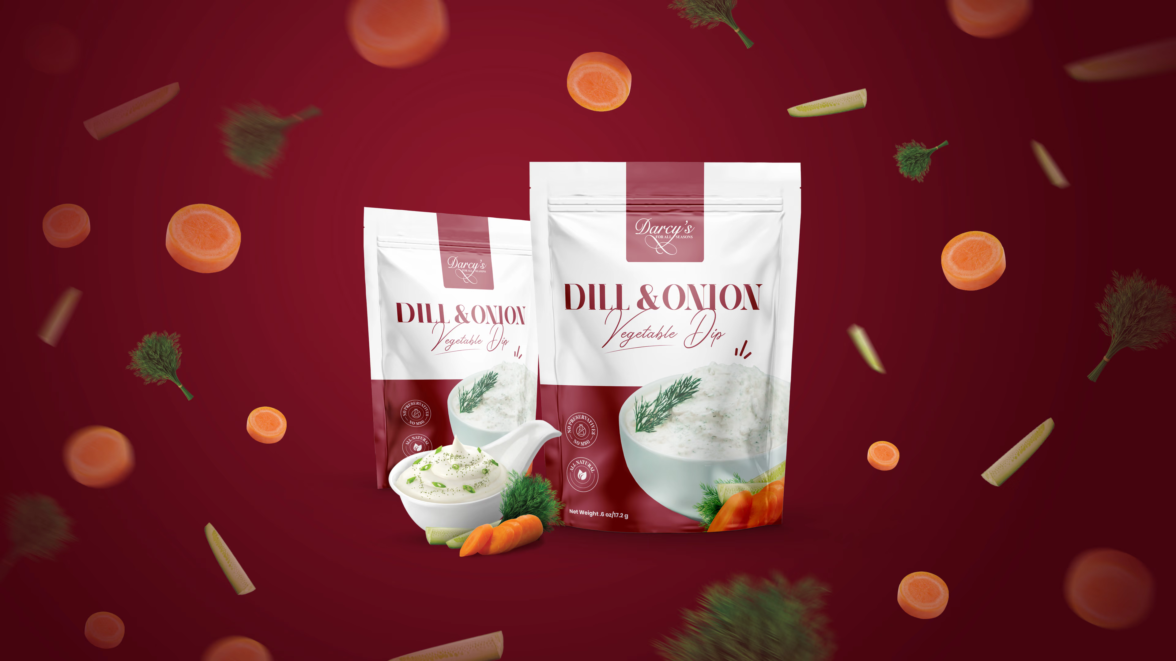
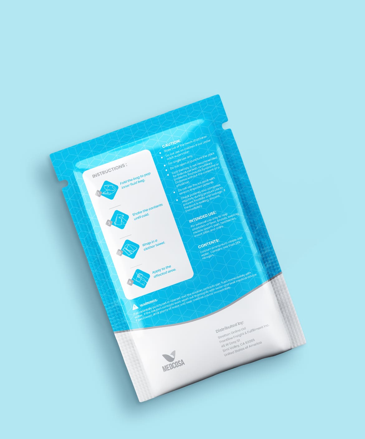
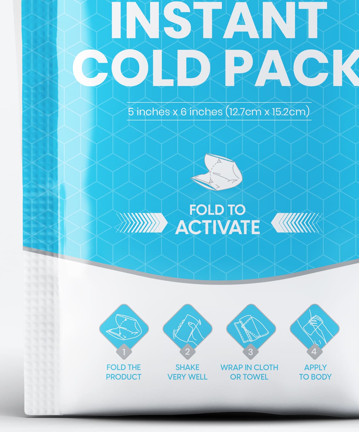
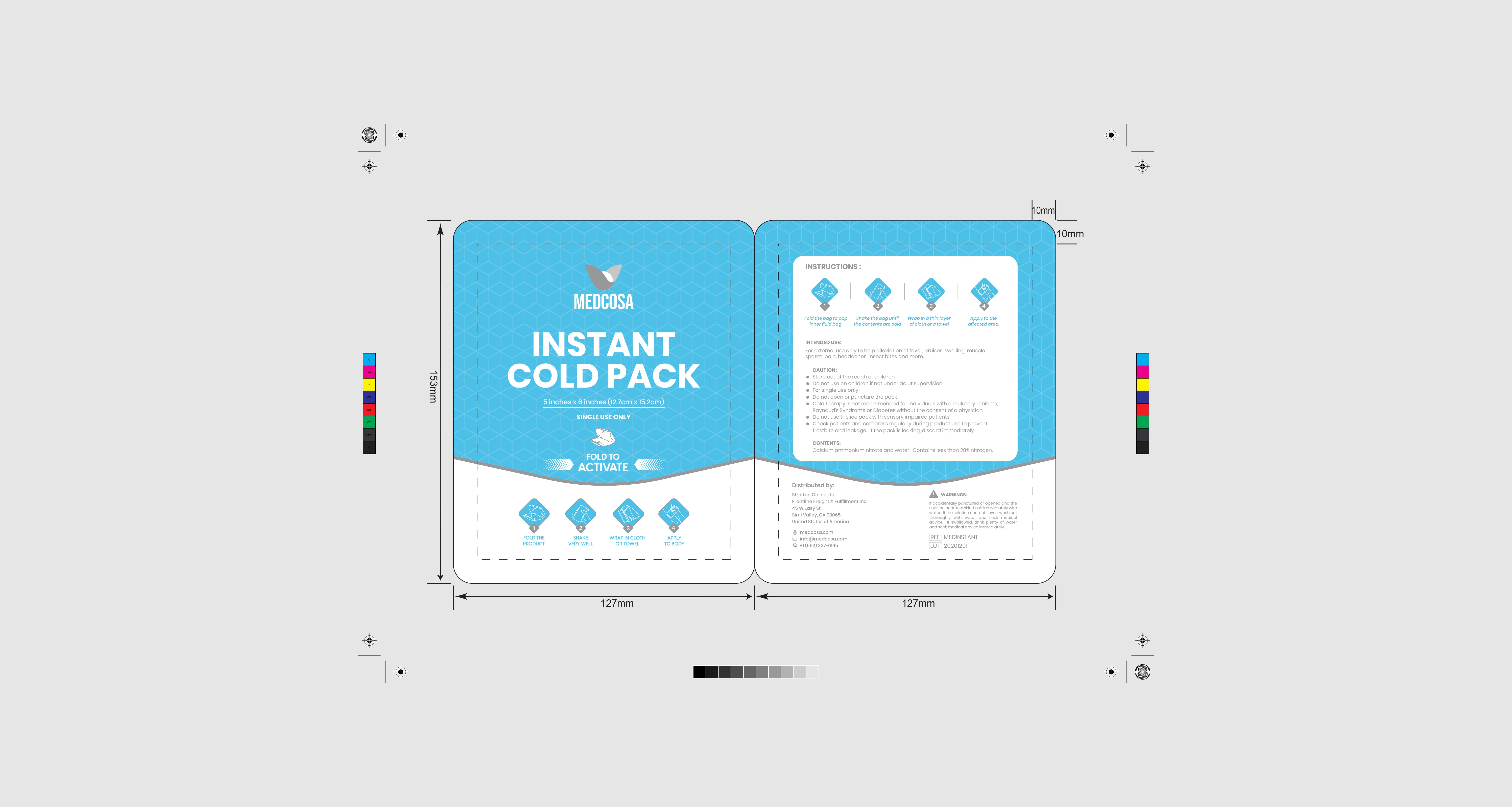
Requirement
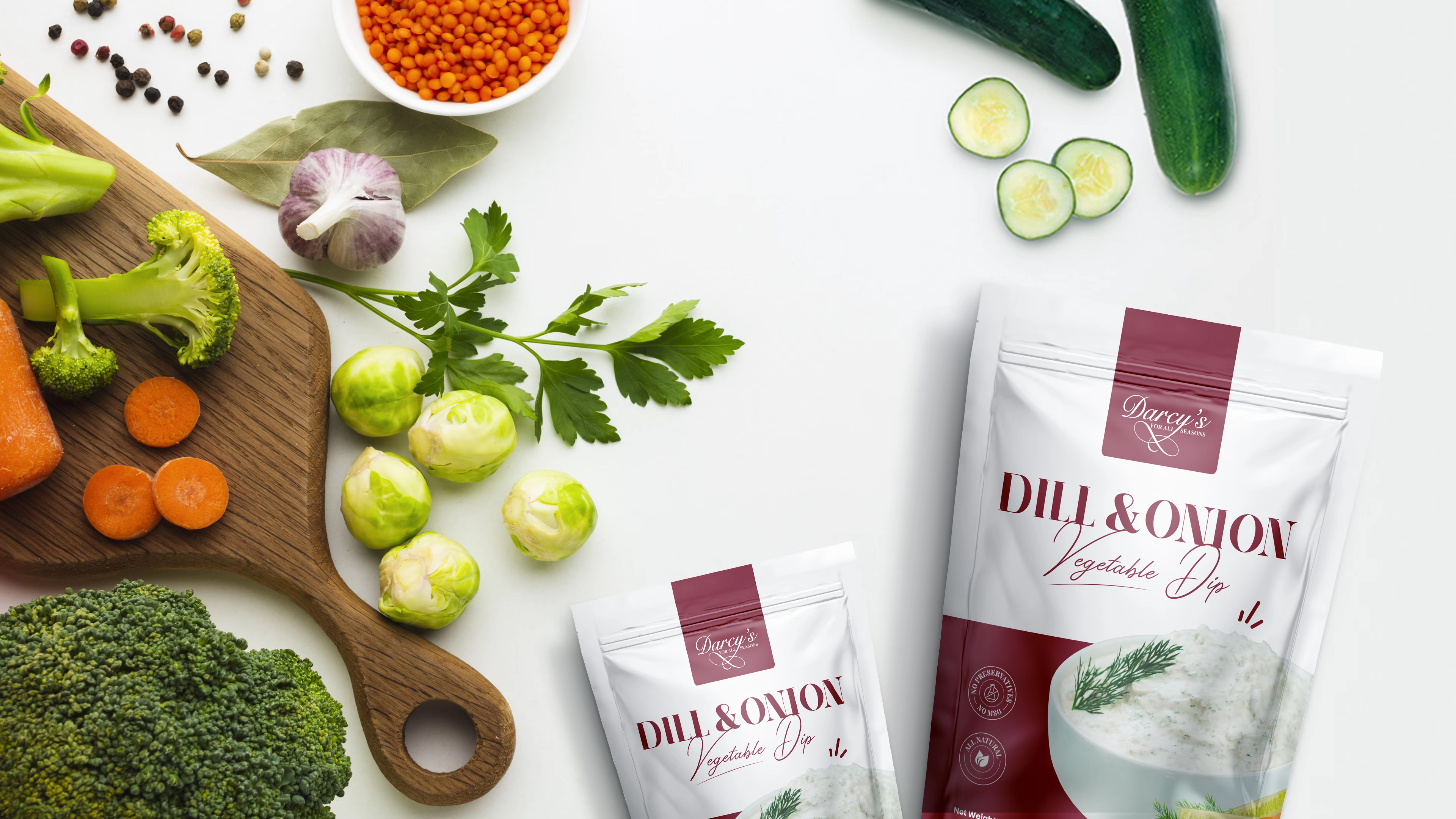
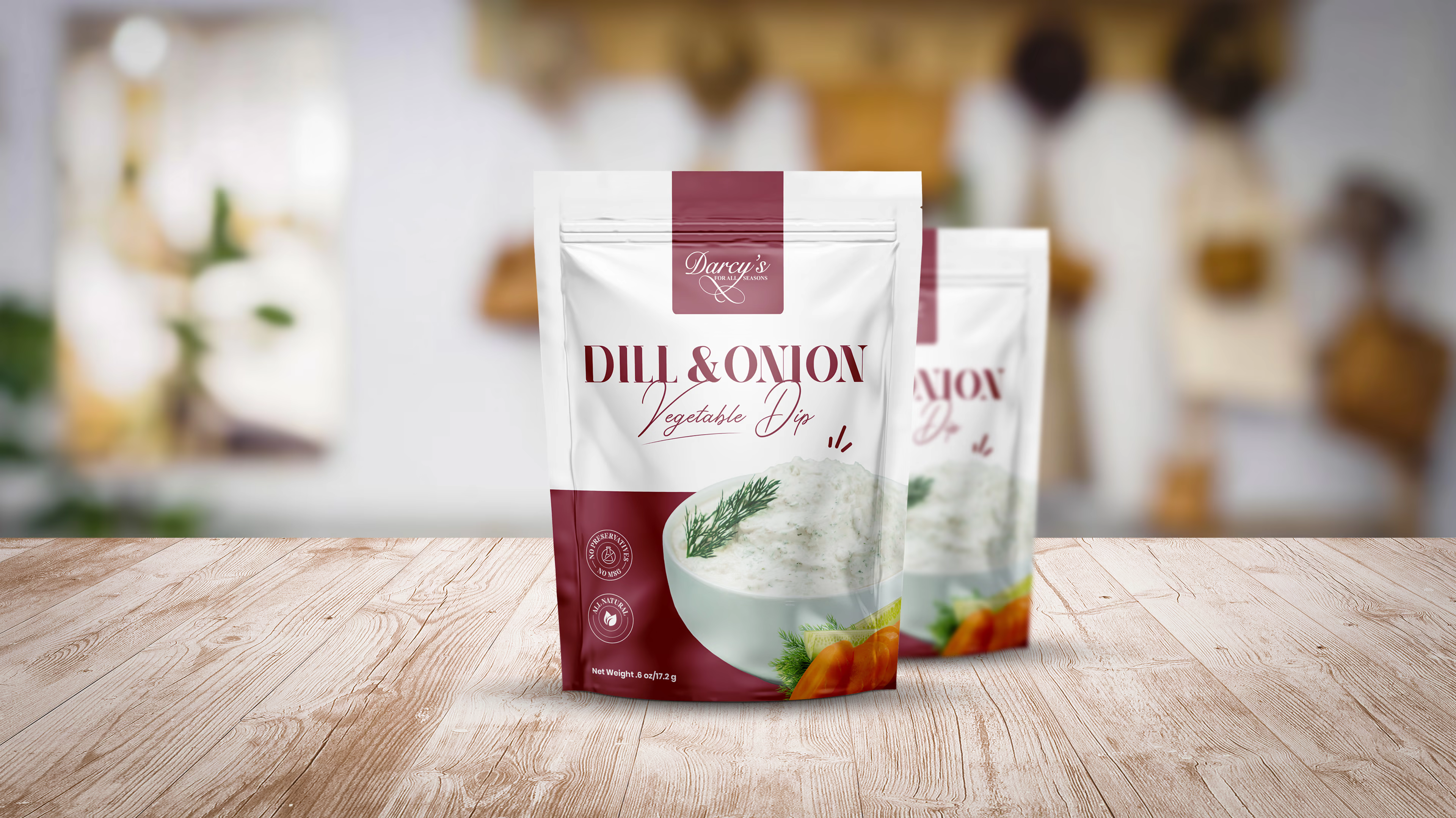
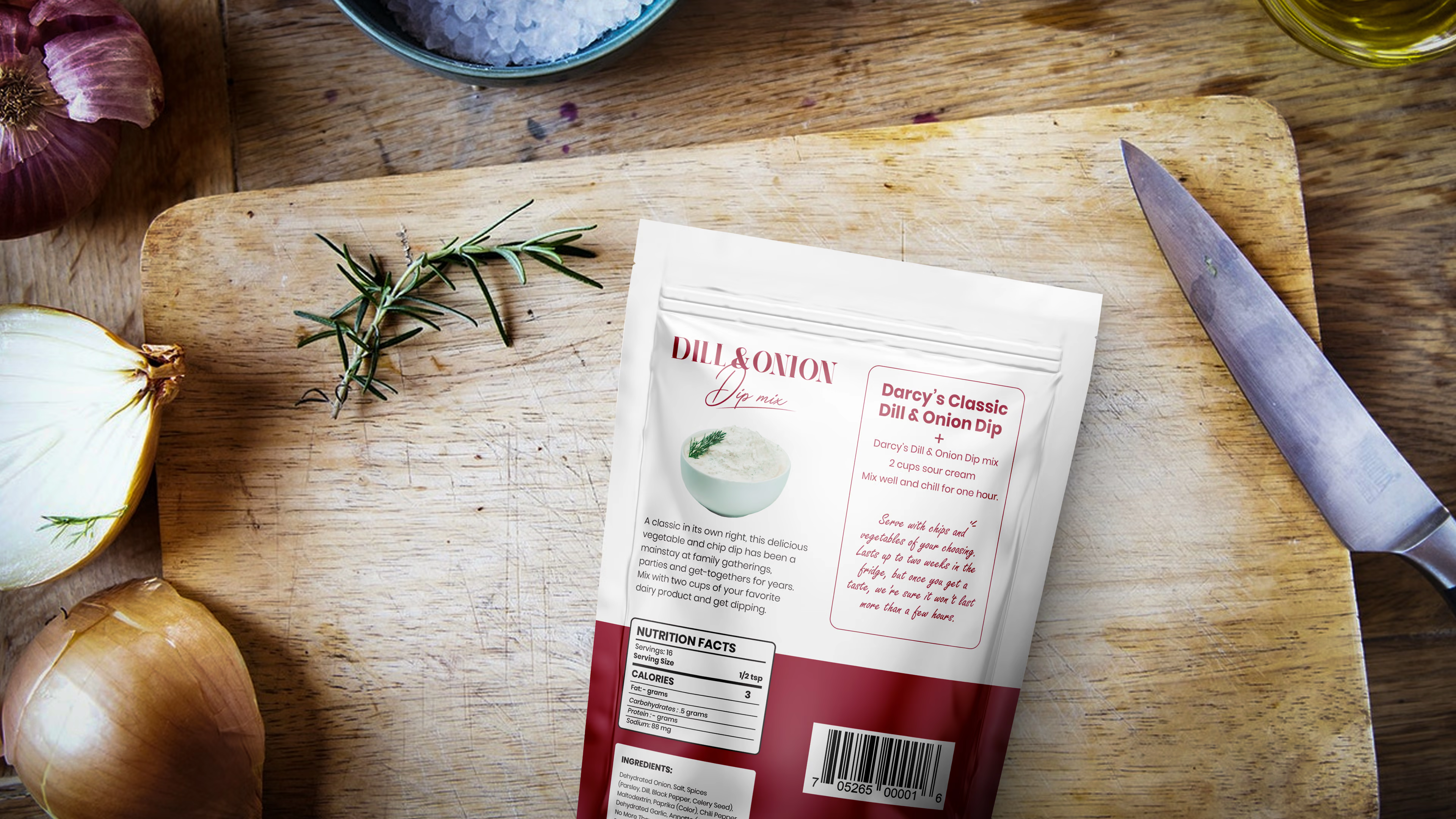
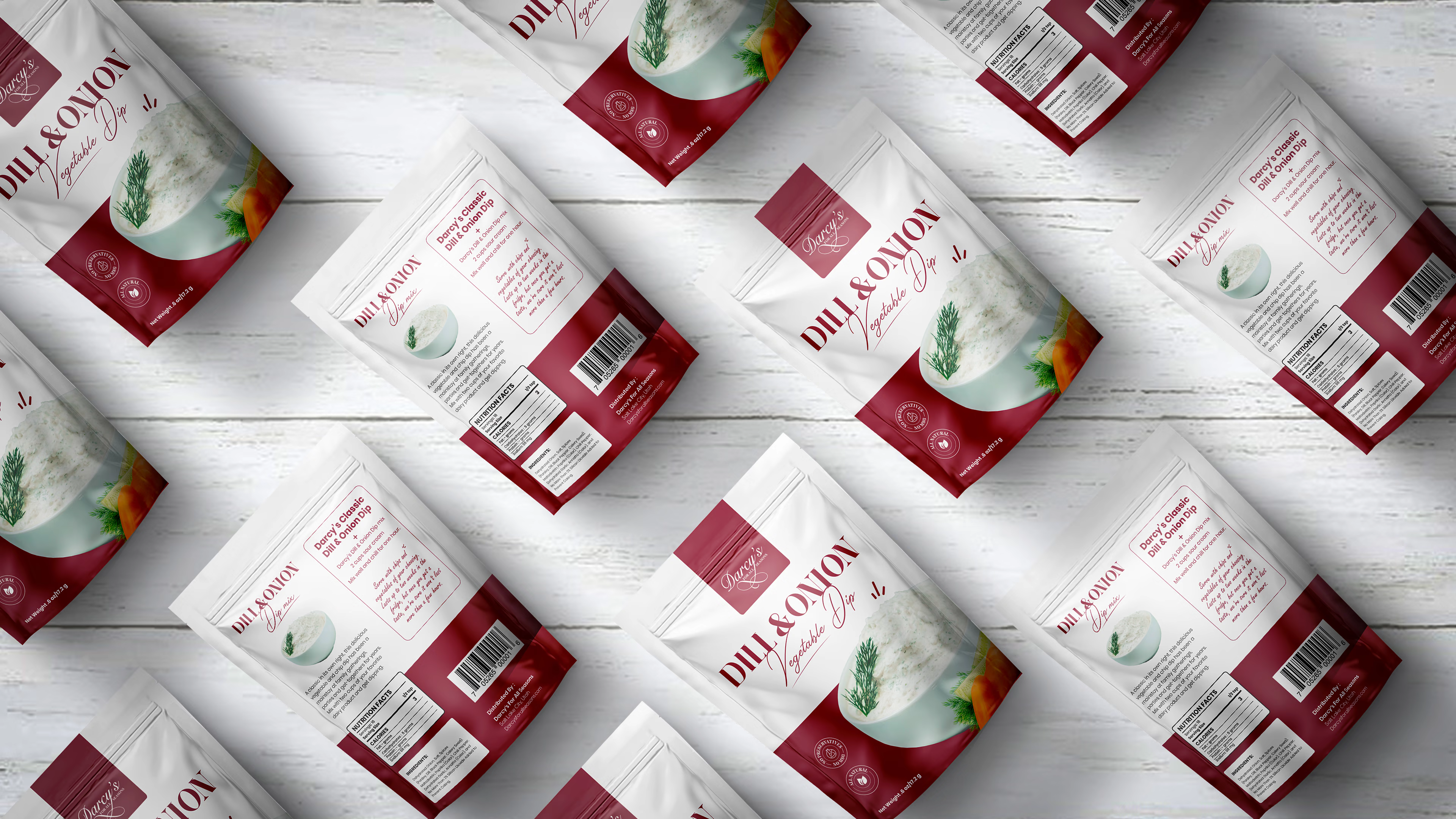
Design was required for Dill & Onion Dip Mix. Client wanted some minimal and elegant design, they were planning to take this product from local grocery stores to national and with a big push for online sales.
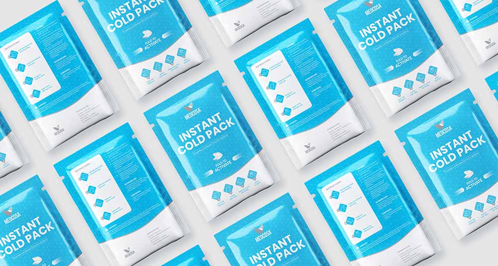
Output
All of the visual elements for Darcy's Dill & Onion Dip Mix had to combine together to create a welcoming and appealing image. It was crucial to display the attractiveness of the product and with that I have added actual dip image and i have also added some vegetable images which people can enjoy with the dip.
I have used their branding color to stand out on shelf and for typography i have tried to make something similar to their logo, this is why i have used script font for "vegetable dip" My goal was to create an effective packaging design that would attract customers to consider purchasing Darcy's Dill & Onion Dip Mix.